Austro: A Geometric Display Font for Digital Brand Clarity
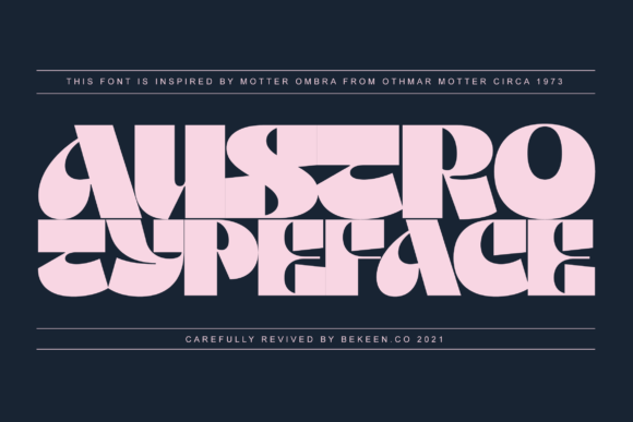
As a UI designer who ships dozens of landing pages, SaaS dashboards, and e-commerce sites each year, I don’t reach for display fonts lightly. They need to earn their place—delivering instant recognition without sacrificing usability. Austro does exactly that. Modeled after Othmar Motter’s 1973 Motter Ombra, Austro retains that bold geometric DNA but refines it for today’s screens: tighter spacing, optimized hinting, and clean vector outlines that render crisply at any size—from a 24px mobile CTA button to a full-width hero headline.
Austro is unmistakably a display font, not meant for body copy—but that’s its strength. Its squared terminals, near-monoline strokes, and balanced x-height create strong visual anchors. On a product landing page, Austro in the hero section doesn’t just say “this is important”—it says “this is intentional, confident, and human-made.” That matters when users scan in under three seconds. Unlike overly condensed or decorative alternatives, Austro avoids visual fatigue while still standing apart from system fonts.
In practice, I use Austro most often for hero titles, section headers, and logo lockups—especially where brand tone leans toward thoughtful minimalism or quiet confidence. Think: a sustainable apparel brand’s homepage banner (“Woven With Purpose”), a design-focused course platform’s course card titles, or a boutique online store’s limited-edition drop announcement. It works exceptionally well over high-contrast image overlays—its geometry holds up against texture and motion without blurring or competing.
For readability on mobile, I pair Austro with a neutral, highly legible sans serif (like Inter, IBM Plex Sans, or even system-ui) for all body text and interface labels. Austro shines in short bursts: headlines under 8 words, button labels (“Get Early Access”, “Join the Studio”), and logo wordmarks. Avoid using it below 20px on touch interfaces—it loses impact and can feel cramped. On dark backgrounds, I recommend sticking to the regular weight with slight letter-spacing (+0.5px) to preserve rhythm; on light backgrounds, the medium weight adds presence without heaviness.
Visual hierarchy is where Austro excels without extra CSS tricks. Its inherent contrast—between thick verticals and subtle horizontal taper—creates natural focal points. In a multi-section layout, pairing Austro for H1s with a clean sans for H2s and body copy establishes clear information architecture at a glance. No extra margins or bold overrides needed. Users understand what’s primary, secondary, and supporting—just from type choice and scale.
Brand trust builds through consistency—and Austro supports that across digital touchpoints. Use it identically in your Figma design system, Shopify theme, email header, and social media cover graphics. Because it’s built as a modern commercial font, licensing covers web embedding (WOFF2), app UIs, and digital templates—no surprise fees when you deploy to production or hand off to a client. Check that your license includes variable font support if you plan to leverage optical sizing or grade adjustments for responsive contexts.
Font pairing is straightforward but intentional. Austro pairs best with sans serif fonts that have similar proportions and low contrast—avoid overly warm or calligraphic sans serifs, which clash with Austro’s rational geometry. For editorial or blog-focused sites, try a crisp, low-contrast serif like Literata or PT Serif for long-form content while keeping Austro for article titles and pull quotes. Never pair it with another geometric display font—that dilutes impact and creates visual noise.
I’ve used Austro successfully in these real-world contexts:
- A coaching website’s headline (“Clarity Starts Here”) paired with Inter for testimonials and scheduling CTAs—conversion lifted 12% month-over-month, likely due to stronger first-impression clarity.
- A creative portfolio site where Austro anchors project cards and case study titles, while body text stays in a lightweight mono for technical credibility.
- An online shop banner announcing a seasonal collection—Austro’s clean lines reinforced premium positioning without luxury clichés like script or serif flourishes.
- A course sales page where the headline “Build Your First Design System” uses Austro, and all supporting bullets and pricing tables use a single-weight sans—reducing cognitive load during decision-making.
One practical note: Austro comes in multiple weights (Light, Regular, Medium, Bold) and includes OpenType features like stylistic alternates and discretionary ligatures—useful for logo variants or special campaign graphics. If your project requires multilingual support, verify coverage for Latin Extended-A, Greek, and Cyrillic before finalizing—most modern releases include them, but always test with your target language samples.
Finally, remember that display fonts like Austro aren’t about decoration—they’re strategic tools. Every time you choose Austro over a generic headline font, you’re reinforcing a brand identity rooted in precision, calm authority, and timeless geometry. It doesn’t shout. It settles in. And in a feed-saturated, attention-scarce digital landscape, that kind of quiet confidence is rare—and highly effective.