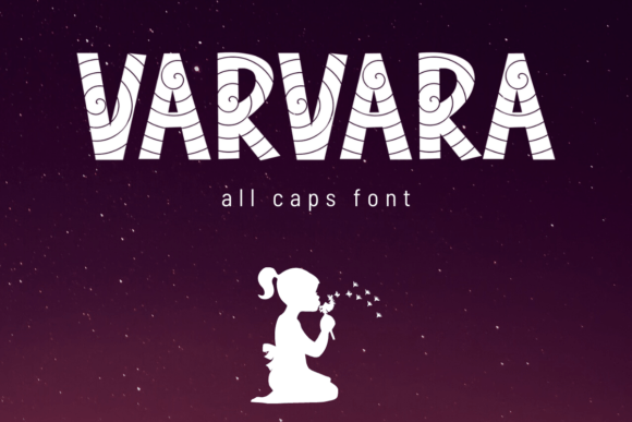
Varvara: A Bold Display Font for Modern Web Design
Yesterday, I was finalizing the hero section of a new coaching website—a clean, warm, purpose-driven layout built for clarity and calm. The headline needed presence without shouting. I opened my font library, scrolled past the usual suspects, and landed on Varvara. Instantly, it felt like the right kind of “pause”: confident, intentional, and quietly distinctive.
Varvara is an all-caps display font—designed not for paragraphs, but for moments that need to land. Its letterforms balance geometric precision with subtle organic warmth: tight spacing, crisp terminals, and just enough contrast in stroke weight to give rhythm without rigidity. It’s modern, yes—but not cold. Playful, but never unserious. That duality makes it unusually versatile across digital contexts where tone matters as much as typography.
I dropped Varvara into the hero headline first—“Clarity Begins Here”—set at 64px on desktop, 48px on tablet, and 36px on mobile. On the live preview, it held up beautifully over a soft-focus background image. No haloing, no blurriness—even at smaller sizes on high-DPI screens. That’s rare for a display font. Many decorative typefaces lose legibility fast when scaled down or rendered on varied devices, but Varvara’s generous x-height and open counters kept it readable even at 28px in a secondary banner on the services page.
It’s worth noting: Varvara shines brightest in short, high-impact roles. Think hero titles, section headers, CTA buttons (especially with ample padding), and logo lockups for digital-first brands. I used it for the main headline, the “Book a Session” button, and the testimonial quote attribution—all in uppercase, all with consistent tracking. It created visual rhythm without repetition. But I didn’t use it for body copy, navigation labels, or form fields—and wouldn’t recommend it for those. That’s not a limitation; it’s intentionality. A great display font knows its role.
For this project, I paired Varvara with Inter—a highly legible, variable sans serif—for everything else: paragraph text, captions, pricing tables, and footer links. The contrast worked beautifully: Varvara brought character and brand voice; Inter delivered neutrality and flow. That pairing isn’t arbitrary—it’s foundational UX thinking. When users scan a page, they need hierarchy they can feel, not decode. Varvara grabs attention; Inter holds it. Together, they guide without friction.
I also tested Varvara across environments you don’t always anticipate: dark mode (it popped cleanly against charcoal), light-on-dark image overlays (with a subtle 10% white drop shadow for lift), and inline social media graphics exported from Figma. In every case, it retained its warmth and definition—no pixelation, no awkward kerning gaps. That reliability matters when your brand lives across platforms, not just one homepage.
Before committing, I checked the technical details—because even beautiful fonts fall flat if they’re hard to deploy. Varvara ships as WOFF2 (optimized for web), includes standard Latin characters plus extended punctuation, and supports basic multilingual needs (accents for French, Spanish, German). No OpenType features like stylistic alternates or ligatures—but honestly? For web use, that’s often cleaner. Fewer variables mean faster load times and more predictable rendering. And yes—it’s a commercial font with clear licensing for web embedding, client projects, and SaaS dashboards. No surprises at handoff.
In practice, I’ve seen Varvara elevate several real projects recently—not just coaching sites, but a boutique online store’s seasonal campaign banner (“Summer Edit”), a portfolio site’s project title cards, and a course sales page where the headline “Design With Confidence” needed both authority and approachability. In each case, it replaced a generic bold sans that had started to feel anonymous. Varvara didn’t just look better—it made the content feel more *owned*, more human.
That said, readability on mobile remains key. I recommend keeping Varvara headlines above 28px on mobile viewports, using letter-spacing between 0.5–1.2px depending on length, and always testing contrast against backgrounds (I check against WCAG AA minimums in DevTools). Avoid stacking multiple Varvara elements too closely—its presence is strongest when given breathing room. One strong headline, well-placed, does more than three competing display treatments.
It’s also worth considering where Varvara fits in your broader design system. If your brand leans editorial—think newsletters, long-form blogs, or thought leadership—you might pair it with a refined serif like IBM Plex Serif for headings, then switch to a neutral sans for body. If your identity is minimalist and product-led, stick with a single-sans pairing like Inter or Manrope. Varvara adapts, but it doesn’t disappear—it asks to be anchored by thoughtful supporting type.
What surprised me most wasn’t how bold Varvara looked, but how *calm* it felt in context. So many display fonts lean into energy or quirk—but Varvara balances strength with stillness. That’s valuable in today’s interface landscape, where users crave clarity over clutter, and trust grows from consistency, not novelty.
If you're choosing a display font for your next landing page, portfolio, or digital brand kit, ask yourself: Does it reflect the tone I want people to feel before they even read the words? Does it scale cleanly across devices? Does it pair gracefully with something simple and legible? Does it come with reliable web formats and clear licensing?
Varvara meets all four. Not as a flashy solution—but as a quiet, confident choice that helps your message land, clearly and kindly.